
Styleguide v3 is here — and it changes everything under the hood
We’re excited to announce Styleguide v3, a major release that fundamentally rethinks how our design system works. Whether you’re a developer building on the platform or someone managing a Municipio site, this release brings a new design token architecture, a clear CSS API, and an interactive Design Builder that lets you customize your site’s look and feel visually — right in the browser. Let’s break down what’s new and why it matters.
What changed?
In short: we replaced a fragile patchwork of Sass variables, hardcoded values, and component-specific patterns with a unified design token system.
In the old version, component styles looked something like this:
// v2 — scattered Sass variable imports and ad-hoc defaults
@use "../setting/var_border-radius";
@use "../setting/var_colors";
@use "../setting/var_fonts";

$c-button-color: var(--c-button-color, var_colors.$color-default) !default;
$c-button-border-radius: var(--c-button-border-radius, var_border-radius.$border-radius-md) !default;
$c-button-font-family: var(--c-button-font-family, var_fonts.$font-family-button) !default;
Every component pulled in its own mix of Sass settings files, defined its own variables, and wired up fallbacks in its own way. It worked — but it was unpredictable and hard to maintain at scale.
In v3, the same component looks like this:
// v3 — clean, declarative, token-driven
@use "../../sass/mixin/tokens";

$_: "c-button";
@include tokens.create($_, getComponentTokens($_));

.c-button {
  border-radius: tokens.use($_, "border-radius");
  color: tokens.get($_, "color--primary-contrast");
  padding: tokens.use($_, "space", 2);
}
One source of truth. One pattern. Every component speaks the same language.
Why we made the change
The old approach had served us well, but it was hitting its limits. Visual values were scattered across multiple Sass setting files (_var_colors.scss, _var_border-radius.scss, _var_fonts.scss, and more), each with their own conventions. When we wanted to make a sweeping design change — say, update all border radiuses or adjust the spacing scale — we had to touch dozens of files and hope nothing broke.
More importantly, there was no clear contract between what the styleguide provided and what implementations could safely customize. Developers were reaching into Sass internals, overriding variables that were never intended to be public API, and then things would break on the next update.
We needed a system that was both more powerful and more constrained — one that gives developers clear customization points while protecting the internals.
The new token system
At the heart of v3 is a design token architecture built around a single JSON source of truth.
Here’s how it flows:
-
Global tokens are defined in
source/data/design-tokens.json— covering spacing, color, radius, typography, shadows, and layout. - A build step (
npm run tokens) generates the corresponding CSS custom properties insource/sass/setting/_design-tokens.scss. - Each component declares which tokens it consumes through a component manifest (e.g., the button declares it needs
border-radius,space,color--primary,shadow, and so on). - At build time, components receive only their declared tokens — nothing more, nothing less.
The token definitions are schema-validated, meaning the system won’t let you reference a token that doesn’t exist or use one that a component hasn’t declared. This catches mistakes at build time rather than in production.
The system also introduces context-aware inheritance through --inherit-* CSS properties. This lets components adapt their appearance based on where they’re placed — a button inside a dark card can automatically pick up appropriate contrast colors without any extra configuration.
The new CSS API
Every component now exposes a clear, scoped CSS API through custom properties. The naming convention is straightforward:
--c-{component}--{token}
For example:
--c-button--border-radius
--c-button--color--primary
--c-card--color--surface
--c-card--shadow-amount
Global theming is as simple as overriding root tokens:
:root {
  --color--primary: #0052cc;
  --border-radius: 0.75;
  --space: 1;
}
Component-level overrides target specific instances:
.c-card--campaign {
  --c-card--color--surface: #111827;
  --c-card--color--surface-contrast: #f9fafb;
  --c-card--border-radius: 1.5;
}
No more guessing which Sass variable to override, no more hoping your customization doesn’t collide with an internal implementation detail. The API is explicit, documented, and stable.
The Design Builder — design your site visually
This is the feature we’re most excited about. Styleguide v3 ships with the Design Builder, a fully interactive visual tool that lets you customize your site’s design — live, in the browser, no code required. This feature is planned for Municipio 6 and will replace much of the heavy lifting currently handled by Kirki.
The Design Builder is a <design-builder> web component that runs in two modes:
Global tokens editor
Navigate to /design-builder and you’ll find a split-panel interface: token controls on the left, a live preview on the right. Adjust colors, spacing, border radius, typography, shadows — every token in the system — using sliders, color pickers, and dropdowns. The preview updates instantly as you tweak values, showing real components (cards, buttons, forms, notices, typography) so you can see exactly how your changes look across the full range of UI elements.
The draggable divider between controls and preview lets you work however feels natural.
Component customizer
On any documentation page, the Design Builder can also run in component customizer mode. Click on any component marked with data-component on the page and a floating panel appears with controls scoped to just that component’s tokens. Want to adjust the border radius on cards without touching buttons? Just click the card and adjust.
The component customizer is also scope-aware. Using data-scope attributes, the same component type can have different customizations depending on where it lives — typography inside a hero section can look different from typography inside a content card, and those customizations stay independent.
Theme presets
The Design Builder ships with seven built-in theme presets that demonstrate the power of the token system:
- Dark Ember — a warm dark theme with muted reds
- Nordic Dawn — light and airy Scandinavian palette
- Forest Mist — earthy greens and natural tones
- Sunset Clay — warm terracotta and amber
- Ocean Ink — deep navy and cool blues
- Aurora Light — soft pastels and bright accents
- High Contrast A11y — an accessibility-first preset with maximized contrast ratios, larger base font (20px), wider line heights, and square corners
Load a preset with one click, then fine-tune from there. You can also save your own presets, import/export configurations as JSON, and reset individual components or everything at once.
For developers: integrating the Design Builder
The Design Builder emits events (design-builder:save, design-builder:change, design-builder:preset-load, etc.) that your application can listen to. The persistence layer is entirely host-controlled — the styleguide ships with a localStorage adapter, but you can just as easily POST overrides to an API, sync to WordPress, or pipe them into your CMS:
document.querySelector('design-builder')
  ?.addEventListener('design-builder:save', (event) => {
    // event.detail.state contains both token and component overrides
    fetch('/api/theme', {
      method: 'POST',
      body: JSON.stringify(event.detail.state)
    });
  });
Redesigned documentation site
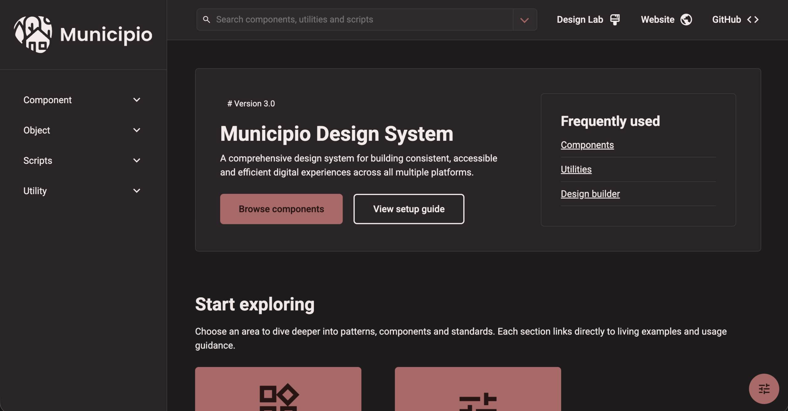
The styleguide documentation itself has been completely redesigned. The new site is organized around clear entry points — Components, Atomic Design, Utilities, Accessibility, Quick Start, and Reference Library — with a collapsible sidebar, quick search, and direct links to the Design Builder.
How this lets us develop further
This is where it gets really exciting. The token system doesn’t just clean up what we have — it unlocks things we couldn’t do before.
We can constrain developers to a clear API. Every token a component consumes is declared in its manifest. If it’s not in the manifest, it’s not part of the public surface. This means we can refactor component internals — restructure selectors, rethink layouts, optimize markup — without breaking anyone’s customizations. Your overrides target the API, not the implementation.
We can make bigger design changes with confidence. Because all visual values flow from a central token set, updating the design system’s look and feel is a matter of changing token values, not hunting through component files. Want to shift the entire platform to a tighter spacing scale? One JSON change. Want to round every corner a bit more? One number.
Build-time validation keeps everyone honest. A suite of validator tests enforces the rules: no raw Sass variables in component SCSS, all CSS custom properties must be namespaced, all referenced variables must trace back to declared design tokens. This isn’t just a guideline — it’s enforced in CI.
What this unlocks for the platform
This architectural foundation opens the door to several improvements we’ve been wanting to make:
Improved design, delivered faster. With tokens as the single source of truth and the Design Builder providing a visual interface, the design team can propose and preview changes without writing a single line of code. Updating typography, colors, or spacing across the entire platform becomes a controlled, predictable operation instead of a risky adventure.
Simplified HTML markup. Because component styles are now driven by tokens and contextual inheritance (the --inherit-* pattern), we can start removing presentational CSS classes and complex modifier chains from the HTML. Components become smarter about their own appearance, which means less clutter in templates and fewer opportunities for markup mistakes.
Dark mode and high contrast. The token architecture is precisely what’s needed to support alternate color schemes. The Design Builder already ships with a High Contrast A11y preset that demonstrates this — 20px base font, maximized contrast ratios, extra line height, and square corners for maximum readability. By swapping a set of token values, the entire platform can shift to a dark theme or a high-contrast mode — bringing us into compliance with EN 301 549 and better serving users who depend on accessible display settings.
What you need to do (Municipio 6)
For most standard usage, the upgrade should be smooth — core components have been migrated and will continue to work as expected in Municipio 6. We are currectly working on implementation in Municipio 6, and a preview will be avabile shortly.
If your project has custom CSS or theme overrides, take these steps:
- Audit your custom styles. Look for references to old Sass variables or legacy CSS custom property names. These may no longer resolve correctly.
-
Migrate to token-based overrides. Replace old patterns with the new
--c-{component}--{token}convention or root-level token overrides. - Test visually. Build locally, check your key templates, and verify that everything looks right.
Wrapping up
Styleguide v3 isn’t just a version bump — it’s a new foundation. By centralizing design decisions in tokens, defining a clear CSS API, providing the Design Builder as an interactive customization tool, and enforcing the rules through schema validation and automated tests, we’ve built a system that’s both more flexible for implementors and more maintainable for the core team.
We can move faster, ship better designs, simplify our markup, and support features like dark mode that were previously out of reach. Designers can explore and prototype in the Design Builder without touching code. Developers get a stable API that won’t break between updates. And everyone benefits from a system that’s consistent, validated, and built to last.
Welcome to Styleguide v3. We can’t wait to see what you build with it.